Optimizing Your Campaign Website for Higher Donations in 24
Optimizing Your Campaign Website for Higher Donations in 24
From Raheel Bhatti
I'm raising money for a cause I care about, but I need your help to reach my goal! Please become a supporter to follow my progress and share with your friends.
Subscribe to follow campaign updates!
More Info
Looking to build a more successful fundraising campaign? It all starts with your campaign website.
Don't believe us? Let's take a look at some data from Nonprofits Source- $44.2 billion has been raised through online campaigns in 2022. Churches that started accepting contributions online have also increased their overall donations by 32%. Fifty-one percent of high-wealth donors are found to prefer to give online.
Indeed, nonprofits cannot underestimate the power of having an online presence. But simply having a website is not enough — it has to be strategically designed to encourage donations if you want real results.
Below are some of our tips on how to optimize your campaign website to boost your success. Let’s take a look at them.
Fifty-two percent of nonprofit website traffic comes from mobile. You risk losing out on many potential donations if your site is not primed for mobile visitors.
Also, note that just because your site can be viewed on mobile doesn’t mean it’s mobile-friendly! Don’t fall for this common misconception. True mobile-friendliness is when you design with a “mobile-first approach”.
This means you create your layout and visuals with a small screen in mind. It also means building simplified functions, menus, and navigation to adapt to mobile limits. This way, you have a beautiful mobile website to begin with, instead of a desktop site that was stripped down just to make it functional for mobile.
What if you already have a desktop site? Then you could use a responsive design. It means the site will automatically adjust to whatever screen size you're viewing the site on. This can be done through code or by choosing a responsive theme on your website builder.
In general, the easier your website is to use, the more people will actually use it.

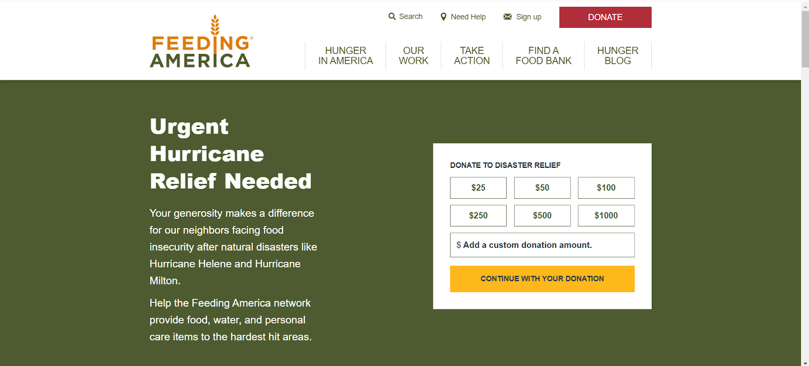
For example, don’t make them wade through multiple pages just to find your donation form. If you can, place it on your homepage. Feeding America has two “Donate” buttons, right here at the first fold of their site.
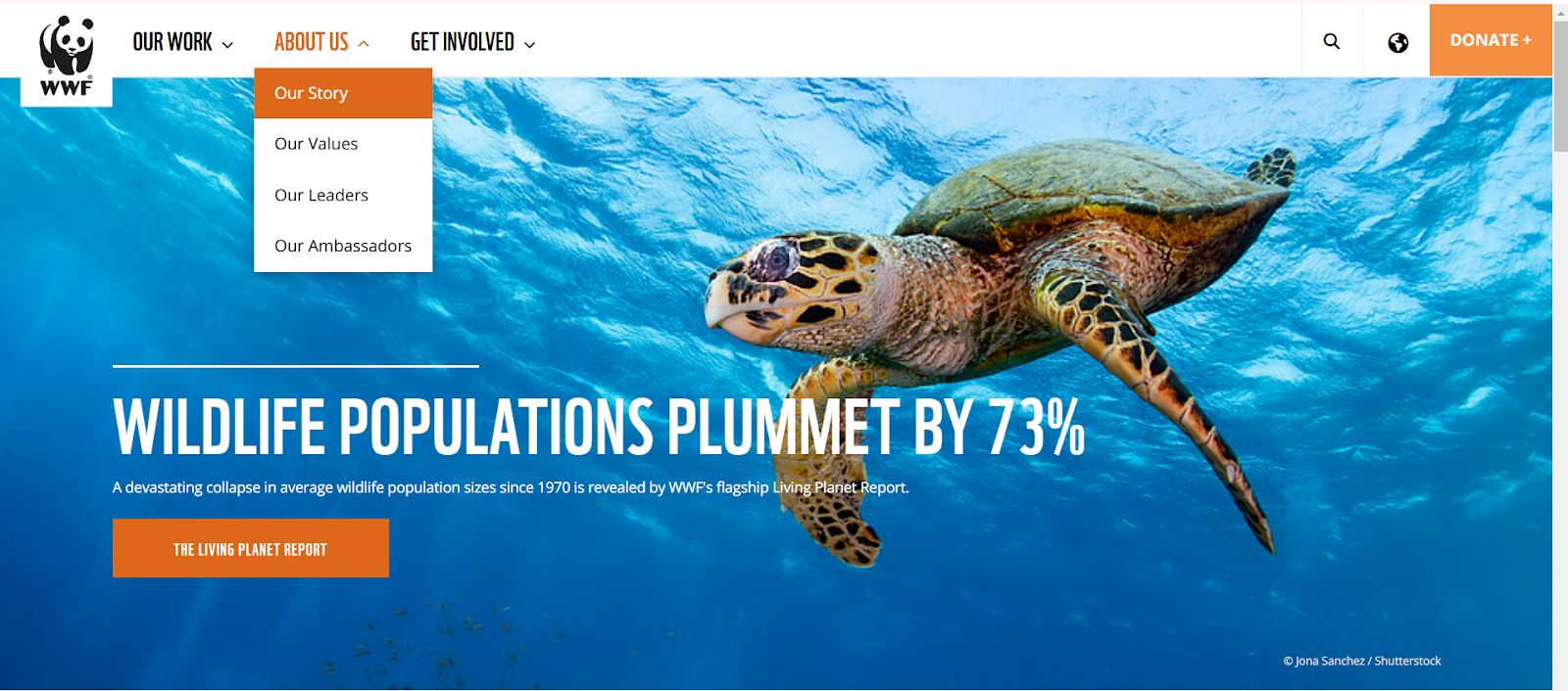
Simplify your menus. Take a look at WWF. They only have three tabs, each with simplified categories under them. You can easily find the correct page to go to since the pages are categorized clearly.

You can also provide a search box so donors can easily find the information they need. Add this search box on the top right, where it’s the most visible.
Use familiar icons. For example, a magnifying glass means to search, coins mean to donate, an envelope means to message them, and so on.
Prioritize your website speed. Slow websites will just frustrate people and may prompt them to leave before they can even donate. You can check Google PageSpeed Insights to troubleshoot any issues that may cause your website to lag.
People are busy. If your donation form takes too long to finish, there’s a huge chance they just won’t donate.
Ask for only the essential information. This includes name, email, contact number, and payment info.
Make sure the forms have enough space as well. Imagine if someone is filling it up on mobile, and they can’t see what they're typing anymore. This just adds more friction to the process.
Make use of buttons as well. Giving your donors options such as clicking a “$50”, “$100”, or “$500” button instead of having them type out the amount shortens the process. It also limits decision fatigue, as they won’t need to wonder what amount they should give.
You can simplify your processes even more by providing multiple payment options.
Credit cards are found to be the most commonly used payment method, so make sure you have those.
Direct bank transfers are another popular method. So are digital wallets like Apple Pay, Google Pay, Venmo, and PayPal.
Consider adding a cryptocurrency option such as Bitcoin or Ethereum as well.
Your donation page is the star of your website. Using social engineering combined with strategic web design can help entice more people to donate.
You can do this by:
Add a sense of urgency. Countdown, timers, trackers, as well as call-to-action text such as “We’re $1,000 away from our goal!” can nudge those “maybes” to action.
Try using website pop-ups or notifications that say “X has donated [amount]” or “X has matched Y’s gift!” This can subtly draw attention to your fundraising, as well as convince people to donate since everyone is doing it.
Directly show the impact of their donation. This can be through photos or videos of the help they can do. You can also do it by text. For example, “$50 can give X amount of clean water to 1 person” or "$50 can feed X families.” Having a clear idea of where their money will go can help convince people to donate compared to a vague promise.
Provide options for recurring donations. Some people are not aware they can donate more than once. Or some may intend to but forget to do it again. By having an automated recurring donation system, you give people the opportunity to donate to you without them having to go through long processes again.
This may seem like an “extra” step, but localizing your website can do wonders.
After all, people from other countries may want to help out too. Giving them a chance to donate by having the website accessible in their language and providing payment options in their currency can increase your donations.
Your button should be impossible to miss.
Place it in spaces where your website visitor's eyes land. This could be your homepage header, after your nonprofit’s About Us page, at the end of your blog articles, and on other key pages.
If you want to be more technical about it, you can also study your website’s heat maps to check where your visitors typically linger. Then try adding your donate button there.
Use bold colors that grab attention. A strong contrast between the button color and the background (think a red button on a white page) makes it pop even more.
Your button text should also be more action-oriented to encourage people to move. Instead of a simple “Give,” try using “Make An Impact” or “Donate Now!”
People are more likely to donate if they feel secure with your organization. Try adding various trust signals to give your website more credibility.
One way is SSL certificates. When you have one, your site will have a padlock or a check mark. It signals to people that your site is encrypted and protected from hacking. If you don’t have one, a “Not Secured” note will appear on your site – not exactly encouraging to see when donating, right?
Is your nonprofit certified? You can also display your badges or seals on your website as another trust signal.
Lastly is the use of social proof. This can be done through reviews, testimonials, and case studies. Highlighting previous successful campaigns shows that other people trust your organization and that you do work that gets results.
You should ideally place all of these on your homepage or your website footer so people can easily see them.
Branding is not just reserved for consumer businesses like Coca-Cola or Apple. Nonprofits can also benefit from having a cohesive and recognizable brand identity.
According to studies, the more people recognize your brand, the more they trust it. Having distinct branding and then applying it consistently to every page of your website can build more credibility for your organization.
So how do you do it? The first is to have a memorable logo design. Think of Nike. You’ll recognize their logo anywhere, right? Your logo should then be stamped on your homepage, footer, donation page, and so on.
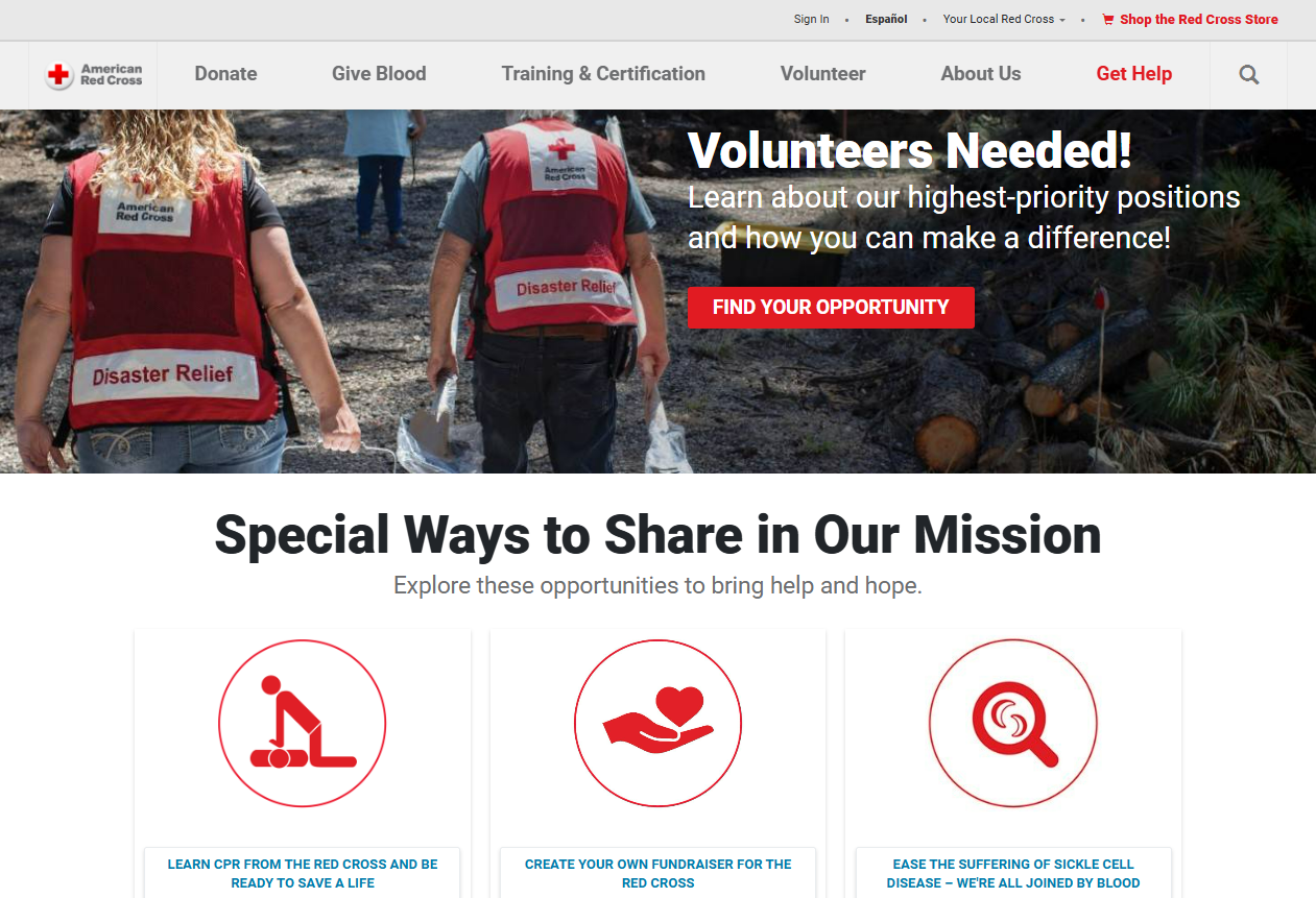
Next is your website color scheme. One example is the American Red Cross. You can see that they mainly use red and white to reinforce their branding.

Other visuals like photographs, illustrations, typography, or icons should also adhere to your branding.
Lastly, don’t neglect your domain name. It should show your organization's name (or at least an acronym if the name is long) so that when people visit your site, they know they are in the right place.
Don’t just forget your donor after they hit “Submit.” Make sure to thank them for the donation. Have a separate Thank You page where you can again highlight where their money will go. You can also use this to show them your fundraising progress and allow them to share their good deeds on social media.
Your campaign website plays a huge role in your fundraising efforts.
Focus on three things to improve it. First is your user experience. A well-designed, easy-to-use website can make the donation process smooth.
Next is marketing. Using techniques such as social proof, social engineering, and adding a sense of urgency can help convince people who may be on the fence to actually donate.
Last is your visuals. A beautiful website is appealing to people, sure. But the strategic use of colors, buttons, photographs, illustrations, and other visual elements can help paint a more vivid picture in your donor’s heads and convince them to take action now.
Add that with a sprinkle of branding, and you’re all set for a donation campaign that is surely headed for success!

Author’s Bio:
Faviola Publico has been in the digital marketing industry for six years and is currently an SEO Content Writer at BrandCrowd, an online logo design and branding marketplace. She specializes in branding and content marketing strategies for B2B and B2C companies.
Campaign Wall
Join the Conversation
Sign in with your Facebook account or email.